Reduce Image File Size for the Web: 3 Steps
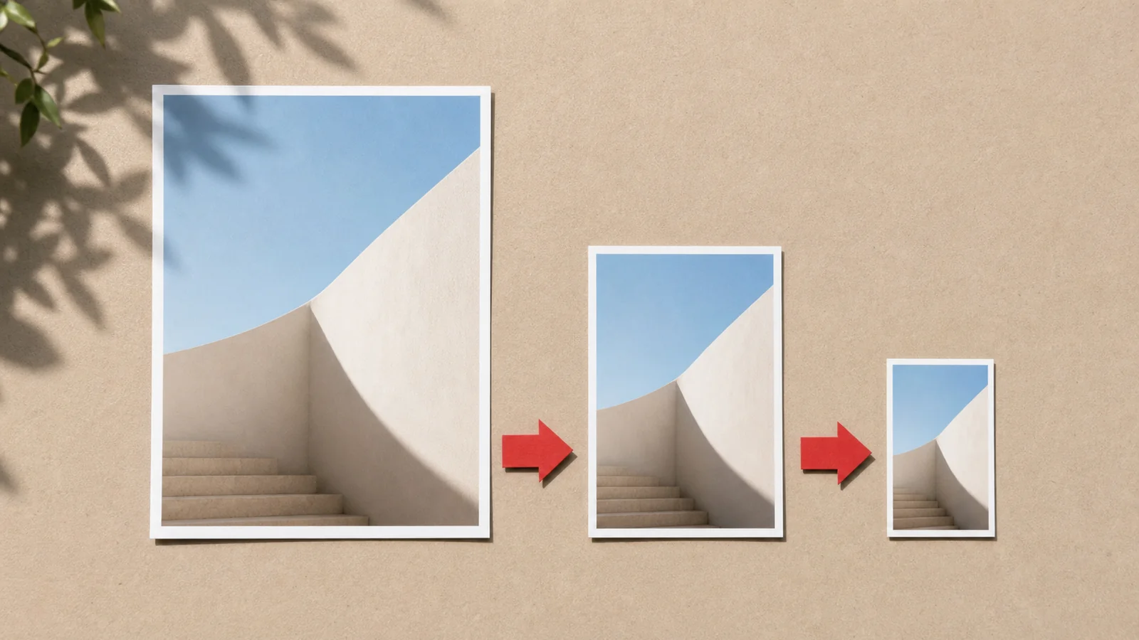
A photo straight off a phone is around 4,000 pixels wide and 3–6 MB. No web page needs that. The fix is a three-step workflow — done in this order, it routinely removes 90% of the file size with no visible loss.
Step 1 — Crop to the frame you actually need
Cropping is free file-size reduction: every pixel outside the frame is a pixel you never have to store, resize or compress. Decide the aspect ratio first — 1:1 for avatars, 16:9 for banners, 1.91:1 for link previews — and crop before anything else. Cropping loses nothing: the pixels you keep are untouched.
Step 2 — Resize to the display size (×2 for retina)
The single biggest win. An image displayed 600 px wide but delivered 4,000 px wide wastes over 40× the pixels. Rule of thumb: resize to twice the largest size the image is ever displayed at — the 2× covers high-DPI screens.
| Use | Resize to |
|---|---|
| Blog content image | 1200 px wide |
| Full-width hero | 1920 px wide |
| Thumbnail shown at 200 px | 400 px wide |
| Open Graph card | 1200 × 630 |
Keep the aspect ratio locked in the resizer so nothing gets distorted; batch mode handles a whole folder in one drop.
Step 3 — Compress into a modern format
Now encode the right-sized image as WebP at quality 75–85 in the compressor, using the before/after handle to confirm with your own eyes (why quality 80 works; which format when). Photos that must open in old software stay JPEG; screenshots and logos stay PNG (or better, start from SVG).
What to expect
A typical 4,000 px, 4 MB phone photo → cropped → 1200 px → WebP q80 lands around 150–300 KB — a 90–95% cut. Aim under 300 KB for content images and under 500 KB for heroes. Every step above runs in your browser on this site; nothing is uploaded anywhere.